Direct Manufacturer
sales@mailerboxfactory.com
Printing & Artwork••8 min read
By Mailer Box Factory Print & Prepress Team

How to Prepare Artwork for Custom Mailer Boxes: Dielines, Bleed, Color and Proofing

A prepress guide to setting up print-ready mailer box artwork: how dieline panels work, the file rules that prevent reprints, how board choice changes your colors, and the proof checks to run before production.

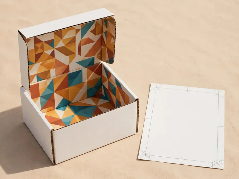
Open white mailer box with a colorful geometric pattern printed inside the lid, beside a flat dieline sheet
Inside printing turns the lid into a second canvas. The flat sheet beside the box is the dieline your artwork has to be built on.

Most artwork problems surface at the proof stage, and nearly all of them trace back to the file rather than the press. A design that looks perfect on a flat screen still has to fold into a three-dimensional box, survive die-cutting, and print on a board that changes how every color behaves. Work through the four stages below and your file will pass prepress the first time.

1. Start With the Dieline: Every Panel Is Its Own Canvas

A dieline is the flat, unfolded template of your box, drawn at exact production size. Every fold line, cut line, and flap on that template becomes a separate panel on the finished box, and each panel needs its artwork placed deliberately. If you have not fixed your dimensions yet, work through our guide on how to choose the right mailer box size first, because the dieline is generated from the size you order.

Outside Panels:

The lid top is your billboard panel, the first surface a customer sees. The front tuck flap and the two side walls carry supporting art, and the base underside is where carriers and customers look for handling marks and reorder details.

Inside Panels:

The inside lid is the reveal panel at unboxing, and the highest-value print space on the box. Interior side walls and the base floor usually carry patterns, flood colors, or a simple repeated mark rather than text.

The Fold Rule: Artwork that crosses a crease line will bend, and fine detail sitting on a fold can crack or shift during converting. Keep logos, faces, and text blocks fully inside a single panel, and let background colors and patterns do the crossing instead.

Never stretch one flat rectangular design across the whole dieline and hope it wraps correctly. Build each panel as its own composition inside the template, using the custom mailer box configurator dieline for your exact dimensions so panel sizes match production, not a generic download.

2. The Five File Rules Our Prepress Team Checks First

These five checks decide whether a file goes straight to proofing or comes back with corrections:

01

Build the File in Vector Format

Supply artwork as a vector PDF, AI, or EPS file with every font converted to outlines. A logo rebuilt from a website screenshot prints soft and pixelated at box scale, no matter how sharp it looked on screen.

02

Design in CMYK, Specify Pantone for Exact Matches

Screens display RGB light; presses lay down CMYK ink. Convert your file to CMYK before sending it, and specify any non-negotiable brand color as a Pantone spot color so it prints from a dedicated ink instead of a four-color mix.

03

Add 3 mm of Bleed to Every Cut Edge

Background colors and images must run 3 mm (0.125") past every cut line on the dieline. Without bleed, a fraction of movement on the cutter leaves a white hairline along the edge of your design.

04

Keep Key Art Inside the Safe Zone

Hold text, logos, and faces at least 5 mm (0.2") inside every cut and crease line. Die-cutting and folding carry small mechanical tolerances, and anything placed closer can clip or land on a fold.

05

Place Photographs at 300 dpi

Raster images need 300 dpi at their final printed size. Product photos lifted from a web page are screen files, and they soften visibly when a press stretches them across a lid panel.

3. Match the Artwork to the Board You Print On

The same file prints three different ways on three different boards. Board choice changes color behavior before ink choice does, so pick the combination that suits your artwork, not the other way around:

Board & Print CombinationHow Color BehavesBest ForBox Style
Bleached White Board + Full CMYK PrintColors reproduce at their brightest and closest to the values in your fileCosmetics, health, and color-led retail brandsGloss White Mailer Boxes →
Natural Kraft Board + 1 or 2 Spot ColorsInk sits on a warm brown base, so whites turn cream and bright colors softenOrganic food, handmade goods, and rustic retail brandsKraft Corrugated Mailer Boxes →
Blush Pink Board + Minimal One-Color PrintThe board itself carries the color story, so the artwork can stay simpleBeauty, fashion, and gift brandsBlush Pink Mailer Boxes →
Matte Black Board + Foil or Spot UVStandard process inks disappear on black board; metallic foil and gloss UV create the contrastLuxury, grooming, and premium unboxing programsMatte Black Mailer Boxes →
Full Print Inside and OutsideThe interior lid becomes a second canvas for patterns, messages, and reorder promptsSubscription boxes and direct-to-consumer launchesPrinted Mailer Boxes →

Board stocks, coatings, and lamination options are covered in depth in our guide to mailer box materials and finishes.

4. Proof Carefully Before the Run Starts

Custom runs start at a 500-unit minimum, and production takes 7 to 10 business days after final proof approval. That makes the digital proof the cheapest place to catch a mistake. Check these six points on every proof:

  • Panel orientation: Open the 3D proof and confirm the inside lid artwork reads the right way up when the box opens toward the customer.
  • Panel placement: Confirm every element sits on the panel you intended. Side wall art is the usual casualty, because left and right walls swap on some templates.
  • Small text: Keep body copy at 7 pt or larger. Reversed white text on a dark flood color needs a bolder weight to stay legible after printing.
  • Barcodes and QR codes: Print them at final size, scan them, and leave a clear white quiet zone around every code before you approve.
  • Color on the real board: Approve color against the board stock you actually ordered, not against a white paper proof from an office printer.
  • Physical sample: For a color-critical launch, order one pre-production sample before the full run and judge it in daylight.

Approve the proof only when every panel passes. Ten minutes of checking at this stage protects the entire production run.

Ready to Put Your Artwork on a Production Dieline?

Build your box in the configurator, attach your artwork to the quote request, and our prepress team will place it on the exact production dieline for your dimensions and return a digital proof for your approval.